You can use a banner to emphasise and link to important topics and EU actions, or to promote campaigns and events.
| The banner includes a clear and succinct message, and can be paired with a call to action link that leads to more detailed information. | How to build this in the Europa Web Publishing Platform (EWPP) |
| The banner is available in full width or content width. Text formatting options can be combined with images or with colour backgrounds. | |
| The Hero banner, which is taller than the standard banner, can be used on a site's home page. It can be used to describe the purpose of the site, or be related to a current event or campaign. | |
| Several text and background styles are available |
Examples
Simple banner

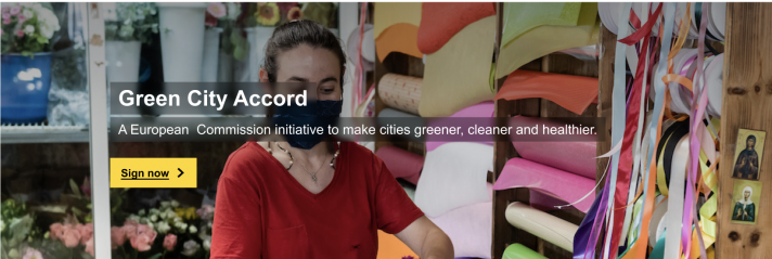
Hero banner left aligned

Text box image banner

Shaded image banner

Gradient image banner
(not yet available in Europa Web Publishing Platform)

When not to use
- do not use when a lot of text is required to communicate your message to users
- do not use when you already have another banner on the same page
- Hero banner: use only on a site's home page. Do not use on internal site pages.
Dos
- always use a short, clear title and description, and a concise call-to-action, if you choose to include one
- limit your title to a single line of text and your description to a maximum of two lines (one line is preferred)
- if your banner is there to introduce your site, use a concise headline that clearly states what you do
- choose left-aligned text option
- select an image with a 4:1 ratio for the XL desktop version (3:1 for the Hero banner). Follow the audiovisual guidelines
- keep in mind when selecting and editing the image that the text box or banner text will obstruct part of the image
- if using an image banner, make sure the main subject is visible at all screen breakpoints. Test your banners at several breakpoints to make sure that your image's subject is not obscured by the text, and is properly cropped
- if you use a shaded image background, make sure your background contrasts enough with your text
- use the full-width variant if the banner appears just below the site header
Don'ts
- don't use more than one page banner on a page
- don't choose images which are too complex to understand easily, or that conflict with the message you want to deliver
- don't choose an image that could be visually intrusive or overwhelm the page content
- don't use centred text when you have a long title or description
- don't use the content-width variant next to a full-width element (such as the header)
- don't allow the subject of your image to be obscured by the text or button: